You look ridiculous with those wires hanging out of your ears (Or, Apple's best product in years)
Seriously, you look ridiculous with those white headphone wires hanging out of your ears. Remember when those wires meant you were cool? That you had the latest technology and were a trend setter? They now say that you are lame. You are behind the times. You don't know what cool is. You might as well wear socks and Teva's.

Remember this? Ads with images like this graced billboards, magazine pages, and tv, making white headphone wires the symbol of cool.
A shift in style, fashion, and technology is happening. Apple defined what digital cool was, and they can change anytime they want. They are replacing the old cool with new cool. The new cool is also the best product they have made in years: the Apple AirPod Bluetooth headphones. This product is so well designed, so well made, they will go down as one of the best product's Apple has ever made. I love this product, more than I ever thought I would. Below is my review.
A few months ago, I purchased a pair of Apple AirPod headphones. AirPods are Apple's first foray into wireless, bluetooth headphones. Sure, they own Beats which offers a few bluetooth options, but this is the first offering under the Apple name, and with the absence of a headphone jack in the iPhone 7, a critical offering.
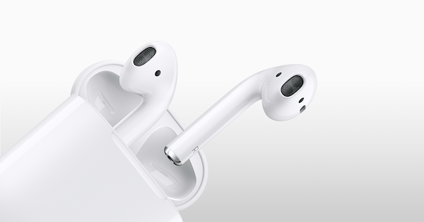
Image Credit: Apple
With this product, Apple took some risks. Instead of making bulky over/on the hear headphones, or those silly around the neck wireless/but not really wireless headphones, they stuck with their iconic headphone design...just without the wires. That means the headphones are two, small pieces. They also look rather funny, with the "stem" that the wires would usually exit from, poking down out of the hear into thin air.
Had I told you a year ago that this is what Apple would do, you'd have thought I was crazy. Today, I am here to tell you that I think this is the best product that Apple has released in years...maybe since the original iPhone. Apple will sell 100's of millions of this product, at the price of $159, which is an attractive combination for Apple and it's shareholders (I am one).
So, why do I like these headphones so much? Read on.
Simple design
The design of these headphones shows exactly what Apple does so well: simplicity. There is nothing unnecessary on these headphones. No buttons. Plain white. Small. Beyond the physical design, they just work. They simply work. Easy to pair. Easy to use. When I first got my hands on them, I thought I'd have to figure out a new way to interact with a nuanced device, but I was wrong. They work out-of-the-box with almost no thought.
Pairing & using
Getting started with AirPods is easy. Just take them out of the box, and while near one of your iOS devices, clip open the lid on the case. They'll pair right away, with some handy visual indicators on your phone to confirm whats happening. One of the things Apple was really smart about was integrating AirPod info into the iOS operating system.
Of course, they also pair with your MacOS devices (laptops & desktops), WatchOS, and any other device that supports Bluetooth 4.0 or higher...even your PC or Android phone. Paring with non-Apple devices won't be as easy, but they still made it nice and simple, with the product's only physical button being a nearly invisible pairing button on the back of the case for pairing with non-Apple devices.
Simple pairing aside, the best feature of AirPods is how easy they are to use! Remove them from their case, put them in your ears, and you are ready to go! Seriously, no other action necessary! No power button, no need to pair, no need to select an output source. They just work, flawlessly! Whether with my iPhone or MacBook Pro, these headphones are the most simple bluetooth device I've ever used.
A few other things: They connection never seems to drop or degrade, I don't have to repair to reset, like I have had to do with some non-Apple bluetooth devices. The range is also great. The version of Bluetooth that they run is rated at up to 60 feet and I can confirm that they do operate well at 30-60 feet from the source. I also find the sound quality to be just fine...I'm not an audiophile or a music nerd, I only need decent sound for podcasts and short term music listening.
Battery & case
Apple did something unconventional for bluetooth headphones when they designed the AirPods, they made it a 3 piece product. The headphones are individual, disconnected pieces for the left and right ears, and they come in a case, making for 3 pieces of hardware.
There is a great reason for this. Apple has created a great combination of size/portability and battery life. They did this by putting a few hours of battery power in the headphones, and many more hours of use through a battery in the case. The case serves as a place to hold/secure your headphones, a way to charge them, and a way to recharge them on the go.
I got my AirPods in mid-April and have used them off and on 5 days per week since then. In early June, I count only 5 times that I had to plug the case into a lightning cable for recharging. Thats because the battery capacity in the case is enough to recharge the headphones themselves many times over. A headphone charge should last for 2-3 hours of continuous use, but I tend to use them for 20-60 minutes at a time, and then put them back into the case for safekeeping and automatic recharging. So, my headphones are almost always at 100% charge when I use them.
This combination of small batteries in the headphones themselves, a larger battery in the case, and a design that encourages placing in the case between uses has resulted in fantastic effective battery life. Like electric cars, battery life is typically the #1 concern of any wireless device.
Light sensors
The first time I used my AirPods to listen to music, I discovered a hidden and useful feature. Each headphone has a light sensor to detect when they are in your ears or not! They way Apple uses this feature is to pause/stop audio....and I presume to also conserve battery life.
When wearing AirPods, removing one from your ear will pause the audio you are listening too (music, podcast, whatever...might also pause audio/video but I haven't tried that yet). Putting the headphone back in your ear resumes the play of audio from where it was paused. Removing both headphones is like pressing stop, putting them back in your ear will not restart your audio.
What a simple, useful and unexpected feature! Thank you to the Apple Engineers that thought of this, its truly a feature that makes these headphones a delight to use.
Tap to control
In addition to removing headphones from your ear to control your phone/computer, there is one other way to interact with your Apple devices through the AirPods: double tap either one of the headphones while in the ear.
The default setting for double tap is to engage Siri. This is handy if you have your phone put away and want to do something like check the time or compose a text. The action on double tap can be changed to play/pause music, and I suspect with future software upgrades to both the AirPds and iOS, we'll get more possibilities.
Its Siri though that makes these headphones powerful. I suspect that Apple will take on Amazon Alexa via headphone integration, not through an in-home device. The killer use-case for voice controlled technology is mobile, and physical devices like Echo speakers will go the way of the landline telephone. Apple knows this and is building for a future that revolves around personal mobile devices for voice commands, and these headphones are a key element of that plan.
What could be improved on
Of course, the product could be improved in a few ways. I miss volume control. The freedom of wireless allows me to put my phone away more than wired headphones allowed for, but I can't control the volume except for with my phone. This is slightly annoying.
I also find that switching between devices to be less seamless than I'd expect from Apple. I use my AirPods with my iPhone and with my MacBook Pro. During the workday, I'll switch between the two a few times. There is no seamless or easy way to switch, and I can't be connected to both at once. So to switch, I have to disconnect from the Bluetooth menu on one device, and initiate connection to the other device. When I do this, it seems to take a long time for the connection to be established.
Finally, I wouldn't mind some other features, like wireless charging, longer battery life, and even some basic noise canceling would be nice. Those things will come with new iterations over the next couple years, and you can bet that I'll be first in line to buy new generations of this amazing product!